NACCU Speedy Benchmark Report: Campus card office online accessibility
NACCU Speedy Benchmark Report: Campus Card Office Online Accessibility
What is a Speedy Benchmark? These quick, one-question surveys are designed to collect data that is important to our institutional or corporate members. The information learned will help guide future NACCU activities.
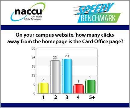
Our members were recently surveyed asking about Campus Card Office Online Accessibility. Specifically, we asked how many clicks away from the college or university homepage is your Card Office page. Here is what we learned:
- Only seven schools that responded are only one click from the campus homepage.
- The average number of clicks from a campus homepage to the Card Office page was 2.7 - WOW!
- The mean and the mode of our collected data showed that the majority of respondents were 3 clicks from the campus homepage.

Why did we want to ask this question?
The "three-click rule" is an unofficial web design rule concerning the website navigation - it suggests that a user of a website should be able to find any information with no more than three mouse clicks. How did your campus do?
What can you do to improve online accessibility?
Work with the appropriate department(s) at your school to try to get a direct link in the main navigation on your campus website.
If being included in the top-level navigation is not possible, try to get a direct link on your Division's web page, and possibly a photo of the sample card or an image with the card branding which links to the card services page.
The more visible the campus ID is on the website, the more awareness and importance of card services will be built.
Every click you can eliminate improves the probability that cardholders can easily find you on the college/university website.
